 This past Monday I came home and was greeted by this box in front of the door, which was a sight for sore eyes.
I had first kicked in some dollars via Indiegogo for a new game start-up, Platinum Series Baseball, to meet some fundraising goals and get out the door.
I’m a sport simulation enthusiast, particularly for games that use cards & dice, and especially baseball.
I’m trying to think of which game companies I have baseball games from, and this is the quick list that comes to mind.
- APBA
- Strat-O-Matic
- Dynasty League
- Replay
- KSP
- Pennant Chase
- Ethan Allen
I’m willing to bet there are a few others. But I’m always interested in trying something new out, and I follow various blogs and vlogs so I am being presented with new ideas for games on a fairly regular basis.
This year alone I’ve seen probably 10 new baseball games using cards & dice. Most, I’ve thought, I could do without. But a few others made me think “Hey, I’d like to check that out.”
Platinum Series Baseball (PSB) was one of them.
I had received notice from Indiegogo stating that shipping was starting on July 27th and I would receive a tracking number for my shipment.
Three days passed and I received no shipment so I posted a notice on PSB’s Facebook page.
That post was deleted.
I messaged them instead and, to their credit, they responded in about 30 seconds letting me know that there were some “first week hiccups” that prevented tracking numbers from going out as promised.
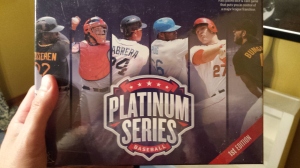 I popped open the box and was created by your usual packing peanuts, and then underneath – ta-da!
As part of my fundraising pledge, I received a game box as well as one supplemental pack of cards.
The game comes with 30 cards – enough to get going with a game.
In addition, you can buy a “full” set of cards, although that includes 600 players, so we’re looking at 20 cards per team.
That should tell you right away that PSB is not intended for the typical replayer. Only having access to 20 cards per team hearkens back to APBA’s earlier days. At least, when I was playing that game in the early-to-mid 80s, that was how many cards were provided per team, although you had the option to buy 5 extra cards per team.
At $125, the price point for the set of 600 cards seems a little steep, although the card stock is very sturdy. I can only imagine that this is part of the elevated price.
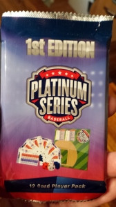 The individual packs, I thought, were a nice idea. For $3 you receive a pack of 12 cards. PSB says that each pack will contain enough cards to field a team – one player at each position plus four pitchers. This does limit things a bit, of course, as it pretty much forces you to field a certain player at each position, and also means you can’t play games with a designated hitter. So if you want to go with this route, you may want to actually plan on buying two packs for each team.
In fact, I had planned to invite a few other gamers to get together for a blind test-play of the game, where each person who attends would get two unopened packs of cards and those 24 cards would represent their team.
Anyhow, let’s dive into the box.
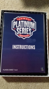 The first thing you’ll be greeted with when opening the box is this instruction booklet.
It’s small and easily digested in just a couple of minutes. It provides you with the quick version of the game with very limited rules and a brief explanation of how the game works.
You might look at this booklet, in fact, and think “Wait. I see all these other symbols and numbers on my game cards, but they’re not explained anywhere in the instructions.”
Well, if you look hard enough, you’ll find text that refers you to their web site for downloading the advanced version of their instructions. Although, to be honest, I had to look pretty hard in this booklet to find that information.
What bothered me about this was that the advanced version of play takes you to 93 pages of rules. I can see how maybe they didn’t want to include that in the package, as it would weigh things down and also require a larger box. But at the same time, asking somebody to print out 93 pages is pretty drastic. Sure, you could leave the PDF on your computer and just open it up whenever you need to reference something, but this is supposed to be a card and dice game. If you need to open up your computer, you may as well play a PC-based game.
Also, it made me wonder if the advanced instructions just weren’t ready for shipment yet and, in a hurry to get the product out the door, they just decided to ask people to go download it themselves.
After reading over the advanced instructions and seeing numerous errors and typos, I was even more convinced that this was the case.
The positive thing, of course, is that an online version of the rules can be quickly modified if there are any issues.
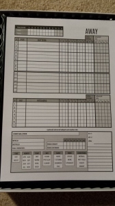 Underneath the instructions was a pad of paper for keeping score.
My initial thought was that I didn’t think the people who printed this out had ever kept score before. These boxes are way too small to write anything down on, unless they expect you to only write things like a check mark if the batter reached base and an O if they were out.
They’re certainly not big enough for more than one character, so don’t expect to be writing “643” or draw lines to track base runner movement. Not going to happen.
Also, why do we have 12 columns of boxes (one for each inning) for pitchers? That doesn’t really serve any purpose, does it? It’s not like any scorecard I’ve seen before and I’ve seen thousands of them.
When I read over the Advanced instruction booklet, however, I saw some recommended ways of keeping score. They were not anything I was used to seeing, but at least they helped explain how the game designed envisioned the scorepad being used.
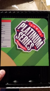 Underneath the score pad is this baseball diamond. The diamond unfolds and you can use it to place tokens that represent your base runners.
This might just be me, but I’ve always found playing surfaces in card & dice games to be a waste of table space. Strat includes it in their box, as does APBA. At least when I bought Dynasty in the late 90s, they did not. I bought Replay about two years ago and, again, I’m pretty sure they don’t include a playing field.
PSB recommends placing your cards inside of card-holders and then moving those cards around the field to show where they are on the diamond.
I’d prefer to just use my scoresheet to indicate where the base runners are or, for that matter, just laying the cards down flat on the playing surface and moving them around that way rather than standing them upright.
Also, putting cards in and out of the card-holders is going to fray the ends of those cards. I like to keep my cards in tip-top shape.
The diamond also includes some quick descriptions of various play results that come off the cards, so you can use that for reference, although I would think once you get one game under your belt, you no longer need that reference. You’ll just know.
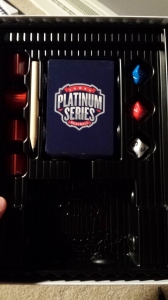 Underneath the playing field is a shrink-wrapped set of 30 starter cards.
Sweet! This is what I came here for!
I unwrapped the deck and found cards that can be used when a pitcher is at bat, numbered Pitcher Batting Card #1 through 11. 11 seems strange. Why not 10? Or 12? The odd number bothers me, but maybe that’s my own hang-up.
There is also a card that can be used if you need a position player to pitch. It’s labeled the “Emergency Pitcher Card”.
Finally, you get to your 30 cards. I’m not sure if everybody gets the same set of 30 starter cards, but I hope not. Because I had some issues with mine.
I got 3 first basemen, 3 catchers, 3 right fielders, 3 left fielders, 2 third basemen, 2 shortstops, 2 second basemen, 2 center fielders. That’s fine. 20 position players in total with 2 or 3 players from each position.
I had the following in my deck:
- C – Conger (HOU), Jaso (OAK), Chirinos (TEX)
- 1B – Butler (OAK), Martinez (DET), Morneau (COL)
- 2B – Weeks (SEA), Murphy (NYM)
- 3B – Sandoval (BOS), Seager (SEA)
- SS – Flores (NYM), Lowrie (HOU)
- LF – Choo (TEX), Shuck (CWS), Gordon (KC)
- CF – Alcantara (CHC), Jones (BAL)
- RF – Blackmon (COL), Stanton (MIA), Kemp (SD)
Then I looked into the pitchers.
Quintana (CWS). Bailey (CIN). Chapman (CIN). Cueto(CIN). Latos (MIA). Parra (CIN). Allen (CLE). Latos (MIA). Cueto (CIN). Chapman (CIN).
That’s right. Of my 10 pitchers, I had 3 duplicates. Chapman, Cueto and Latos were each doubled up.
So instead of a starter set of 30 players, I really had a starter set of 27.
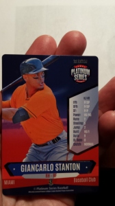 The cards themselves are attractive, with an action shot of the player on the front of their card, along with some ratings and data.
One thing you’ll notice is the lack of any identification of which team the player appeared on. Sure, you have the word “Miami” here for Giancarlo Stanton. But you’ll also see “Baseball Club” listed for the team name on each card rather than “Marlins”, for example.
Also, you’ll see each player card image has had all team logos airbrushed out of them. No rainbow “M” on Stanton’s helmet or “Marlins” across his chest.
Let’s take a look at the back of the card.
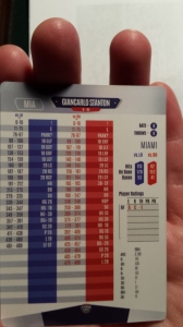 Here’s where things get a little crazy for me.
For those who are Strat-O-Matic players, you’ll be used to the idea of the 50/50 game system – half the rolls come from the pitcher card and half from the batter card. And if you play Dynasty League (or played Pursue the Pennant) then you’ll really be used to this, as those are also 50/50 game engines but ones that use 10-sided dice instead of 6-sided.
Red, white and blue 10-sided dice are rolled and read in that order, yielding a number between 000 and 999. Rolls from 000 to 499 come off of the batter card and 500 to 999 from the pitcher card.
Looking at Stanton’s card, for example, if he was at bat and you rolled a 204 while he is facing a left-handed pitcher, he would hit a home run. The same roll while facing a right-handed pitcher is a strikeout.
I’ve played quite a few games of Dynasty in my day and I’m fine with all this. The problem is…
Well here, let’s do some quick comparisons.
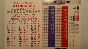 I’ve been playing some 1901 APBA lately, so here’s a card from that set.
This is Christy Mathewson’s card from 1901. Instead of the four colors (red, blue, grey, black) present on the PSB card, it uses just three (red, green, black).
But what should really stand out to you is the font size.
For every 2 rows of readings on the APBA card, you have 3 rows of readings on the PSB card. The PSB card uses a font size that is 67% that of the APBA card.
This might be fine if you have the eyes of an eagle, but most folks who are into the card & dice sims are older. I attend quite a few events with other gamers and, at age 41, I tend to be one of the younger guys there. Most are in their 50s and 60s.
Furthermore, read forums at some of the other game companies and you’ll see fairly regular requests for them to print cards with larger fonts.
PSB goes the other way and actually prints them even smaller.
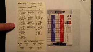 Here’s a comparison to a Strat-O-Matic card, as well. This being the 1984 Mike Schmidt card.
I’ve even put my finger on the card so you get a little bit of a reference point there on font size.
Again, for every 6 rows on the Strat-O-Matic card, you have 8 rows on the PSB card. So the PSB card uses a font size that is 75% that of the Strat-O-Matic card.
Reading these play results with any regularity is going to give a player like me a massive headache.
Also note some other weird thing on the card. For example, Stanton’s batting average is expressed as “0.288”. Zero point two eight eight? Why not just “.288”, like you’d see anywhere else on the planet? I later found a card for a player who had batted .270 and his card read “0.27”, which leads me to believe that a .300 hitter is going to appear as “0.3” – awful.
That came across as very amateurish. I’m not sure if the fault is on the game company or the printers, but it’s something that needs to be corrected in a future edition.
Furthermore, as microscopic as the play result readings are, check out the font on those stats. It’s even more minuscule. There’s really no point to those stats appearing anywhere on the card, they’re so impossible to read.
Perhaps in a 2nd edition PSB could shuffle things around. For example, take the area above the fielding ratings and lay them out with rows labeled “vs LH” and “vs RH” and columns labeled “H”, “OB” and “TB”.
That would open up two extra rows, so your stats could have more room so you could use a larger font? Also, stats could be divided up into two columns (AVG, G, AB, R and H in one column and 2B, 3B, HR, RBI and SB in the other), so the overall font could be roughly twice as large.
Another nit-picky thing, team abbreviations appear on the cards, but there is no distinction between franchises from cities who have multiple teams. So you’ll see “CH” whether the player appeared for the Cubs or White Sox; and with team logos scrubbed off of player images, there’s really no way to tell unless you happen to know which team they appeared on. Ditto for “NY” being used for the Yankees and Mets. They used traditional team codes elsewhere (MIA, COL, HOU, etc.) so why not CHN, CHA, NYN and NYA? Or CHC, CWS, NYM and NYY?
It’s a little thing, but it all adds up to a product that doesn’t quite live up to my expectations.
I opened up my individual pack and there were no duplicates in there. (Hooray!) My card set went:
- C – Molina (STL)
- 1B – Teixeira (NYY)
- 2B – Tolleson (TOR)
- 3B – Harrison (PIT)
- SS – Ramirez (CWS)
- LF – Cespedes (DET)
- CF – Lagares (NYM)
- RF – Kiermaier (TB)
- SP – Lynn (STL)
- RP/SP – Martinez (STL)
- RP – Ziegler (ARI), Carpenter (NYY)
Of course, game play is important, so I want to dive into a review of that as well.
But first I have to send my PDFs off to a FedEx for printing.
UPDATE: I was unable to play a game. I tried to start a game and got one batter in before deciding it was going to be impossible to play. I used my wife as a test subject, by the way, bringing her a card of Yadier Molina, one of her favorite Cardinals. I held up the card for her and asked “Can you do me a favor?” “Sure.” “Read this,” I said, holding up a card for her. She looked at it for about 2 seconds and then grabbed the sides of her head and looked away, yelling “OH MY GOD. How can you look at that? That’s horrible!” “What do you mean?” “The print. I can’t read anything and… white on red? Are you kidding me?” In short, look for my copy on eBay soon. If somebody tells me this is being addressed in the 2nd edition, I’ll give it a shot then.
Very disappointing.
There is a reason why there are no team logos and team names. You need a license from MLB to use those logos and names. This product only has a license with Major League Baseball Players association, that’s why PSB can use the players’ likenesses. Topps baseball cards have an exclusive license with MLB to produce baseball cards. I’m speculating but that could be a reason why PSB was unable to use team logos and names.
No, I’m sure you are correct, Dan. Thanks. I meant to point that out but guess I forgot.
It’s the same reason you’ll see other game companies (Strat, APBA, Dynasty, Replay, etc.) just list “NEW YORK (A)” on their card instead of “NEW YORK YANKEES”.
I’m glad you mentioned the font size on the card. That’s a huge problem that I haven’t even tried a game yet. I’ll add that it’s not only the reduced font size. It’s the contrast of white numbers on red or blue backgrounds. Or red numbers on grey. With the smaller font, it makes it very difficult to read for older guys, as you pointed out. It did diminish my initial excitement as I knew if I tried this game, it would be slow as I’d have to move my head around trying to get the absolute best focus through my progressive lenses. (Old guy problems…)
Thanks for pointing out the contrast. Definite issue as well. I have been worked in web design for about 15 years now and I also noticed those color choices there and thought “Oh no…” I’m hoping that, if there is a second iteration of the product, some of these problems are corrected.
For the record, I tried to play a game and got through one plate appearance and threw my hands up and quit. I just could not read the cards.
Disclosure: I am 41 years old and wear contact lenses. I couldn’t read the cards with contacts in. Switched over to glasses and still couldn’t read them. :-(
I think the quality of the cards is very impressive. Very sturdy, thick stock. Colorful. For many years I have hoped to see player pictures combined with a realistic tabletop game. Yes, the fonts are ridiculously small, but I could struggle through that, if the advanced game made sense. Regrettably, it does not. I printed out the advanced rules, which sadly were taken from another free, online game (that had adapted the old Pursue the Pennant game. Please see–http://www.ibl.org/~sweda/2015/07/status-of-2015-cards/), and I quickly realized that Platinum Series really doesn’t know how to play their own advanced game yet, since the game engine wasn’t even their idea.
The game may be fun in a very basic format. But for replayers, or those seeking advanced ratings and realism, it will not work for many reasons. The clutch ratings, for example, do not make sense. Hitters will occasionally earn the clutch rating, but I could find no pitchers that do, and I have all the cards. Several cards I looked at, just in a quick scan, seemed to be inaccuarte. Francisco Rodriguez, for example, is virtually unhittable. Other cards looked similarly overachieving on the pitcher end. I think if they hired someone who better understood how the game engine worked, they could have something decent.
Also, the amount of players won’t work for replayers. Few teams have anything approaching a full 25 man roster. The Brewers, for example, do not have enough for a backup catcher. Plus, the players are placed on the team they started the 2015 season, rather than the team their cards were based on for the 2014 season. That is offputting for replayers.
I hope Platinum can catch up on the game engine side of things, because I think the look of the cards (font size set aside) is really cool. But, for now, it’s more of a baseball card set that has little gaming value for those seeking realism and accuracy. I will look at the cards once in a while, but I will never play it.
Revised comment. I couldn’t edit my mistakes on my posting. Rats…
I think the quality of the cards is very impressive. Very sturdy, thick stock. Colorful. For many years I have hoped to see player pictures combined with a realistic tabletop game. Yes, the fonts are ridiculously small, but I could struggle through that, if the advanced game made sense. Regrettably, it does not. I printed out the advanced rules, which sadly were taken from another free, online game that had adapted the old Pursue the Pennant game. (Please see–http://www.ibl.org/~sweda/2015/07/status-of-2015-cards/), and I quickly realized that Platinum Series really doesn’t know how to play their own advanced game yet, since the game engine wasn’t even their idea.
The game may be fun in a very basic format. But for replayers, or those seeking advanced ratings and realism, it will not work for many reasons. The clutch ratings, for example, do not make sense. Hitters will occasionally earn the clutch rating, but I could find no pitchers that do, and I have all the cards. Several cards I looked at, just in a quick scan, seemed to be inaccuarte. Francisco Rodriguez, for example, is virtually unhittable. Other cards looked similarly overachieving on the pitcher end. I think if they hired someone who better understood how the game engine worked, they could have something decent.
Also, the amount of players won’t work for replayers. Few teams have anything approaching a full 25 man roster. The Brewers, for example, do not have enough for a backup catcher. Plus, the players are placed on the team they started the 2015 season, rather than the team their cards were based on for the 2014 season. That is offputting for replayers.
I hope Platinum can catch up on the game engine side of things, because I think the look of the cards (font size set aside) is really cool. But, for now, it’s more of a baseball card set that has little gaming value for those seeking realism and accuracy. I will look at the cards once in a while, but I will never play it.
So glad to see I’m not the only one driven crazy by tiny fonts. I had to write a card output tool over Christmas because my Dad can’t read anything with a small font anymore.